Since March 2021, I started working at Meijer as a designer focusing on improving how their digital interfaces look and work. Meijer is a big store chain in the Midwest. I'm part of the team that works on their online retail, grocery shopping, and home-delivery services. The design team at Meijer Digital is expanding quickly, and we work in Agile mode which helps us work closely together.
Excited to share my work:
Spearheaded the optimization of the Coupons feature, overseeing the end-to-end responsibility for its relaunch.
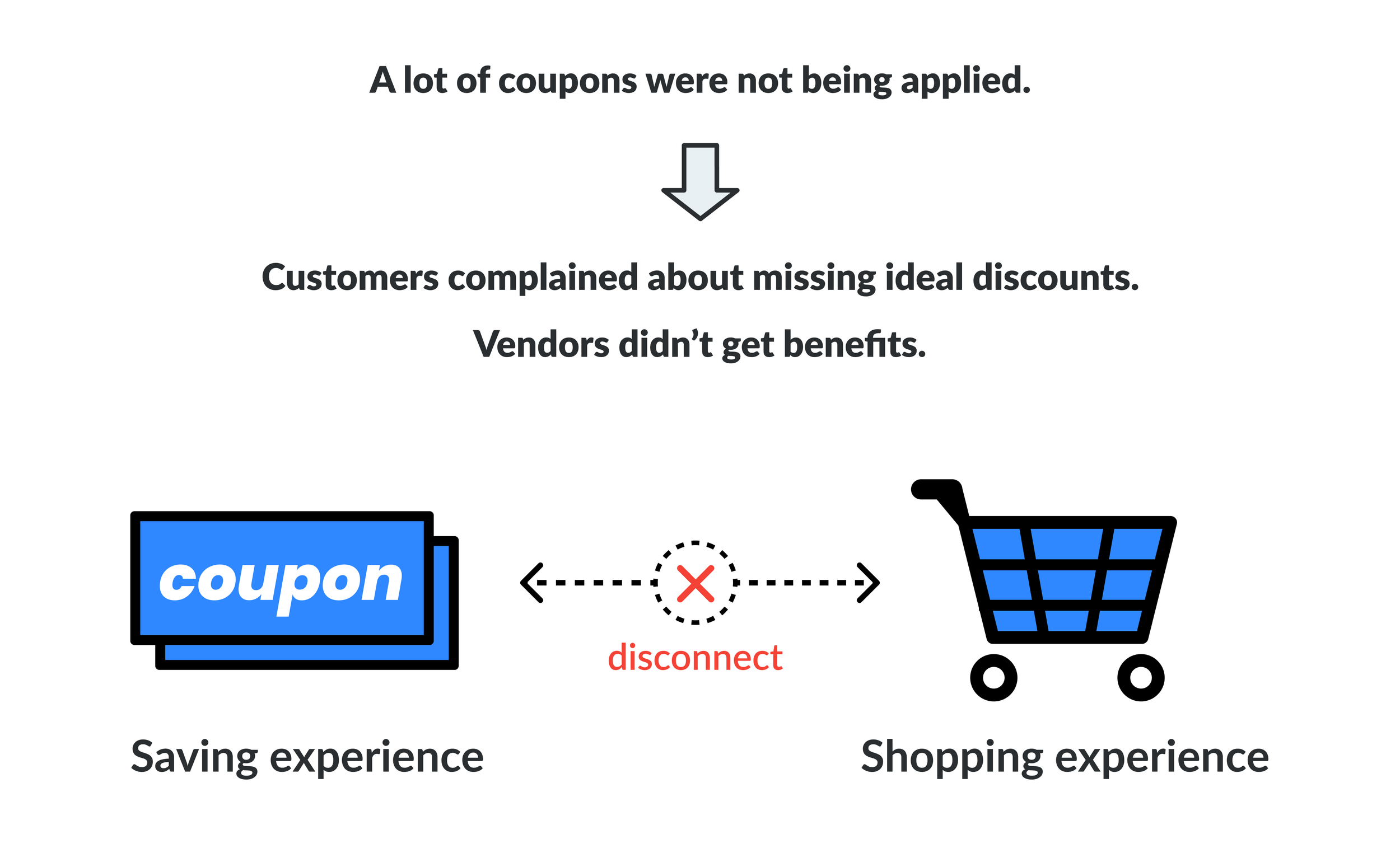
Upon joining Meijer, my initial major project involved reiterating the Savings feature, Coupon. As a critical loyalty component for many users engaged in daily grocery shopping, the initial version of the Coupon feature exhibited functional limitations. Users were unable to directly purchase products within the coupon section, resulting in a disruptive shopping experience. Furthermore, the disconnection between Coupons and Products led to a relatively low percentage of applied coupons.
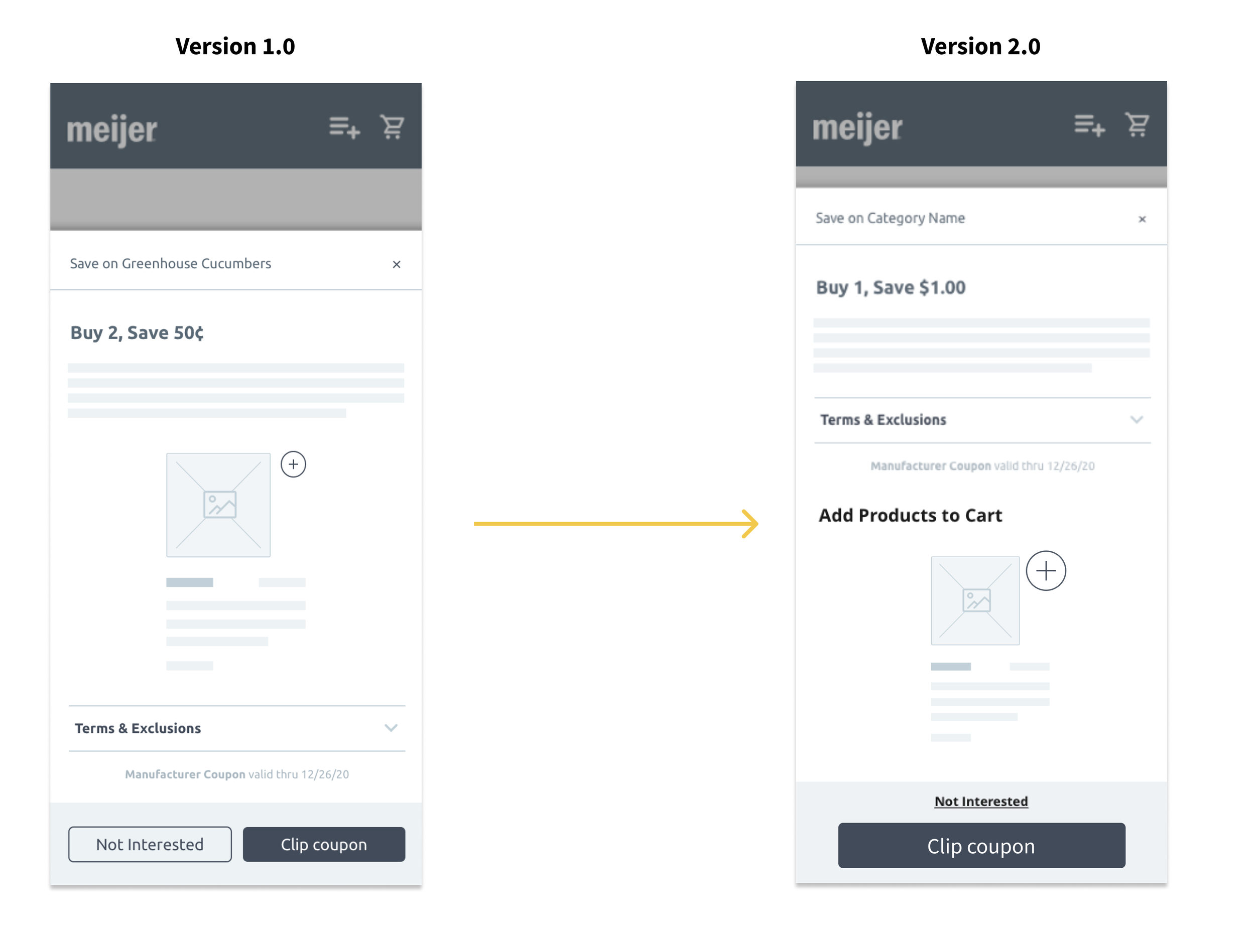
Taking charge of this initiative, I successfully integrated the purchase experience into the coupon section, enabling users to directly shop with discounts. Picture this: upon finding an enticing coupon, users can navigate to the coupon detail page, view related product information, and seamlessly add them to their cart. This transformation marked a significant enhancement in the overall shopping experience.
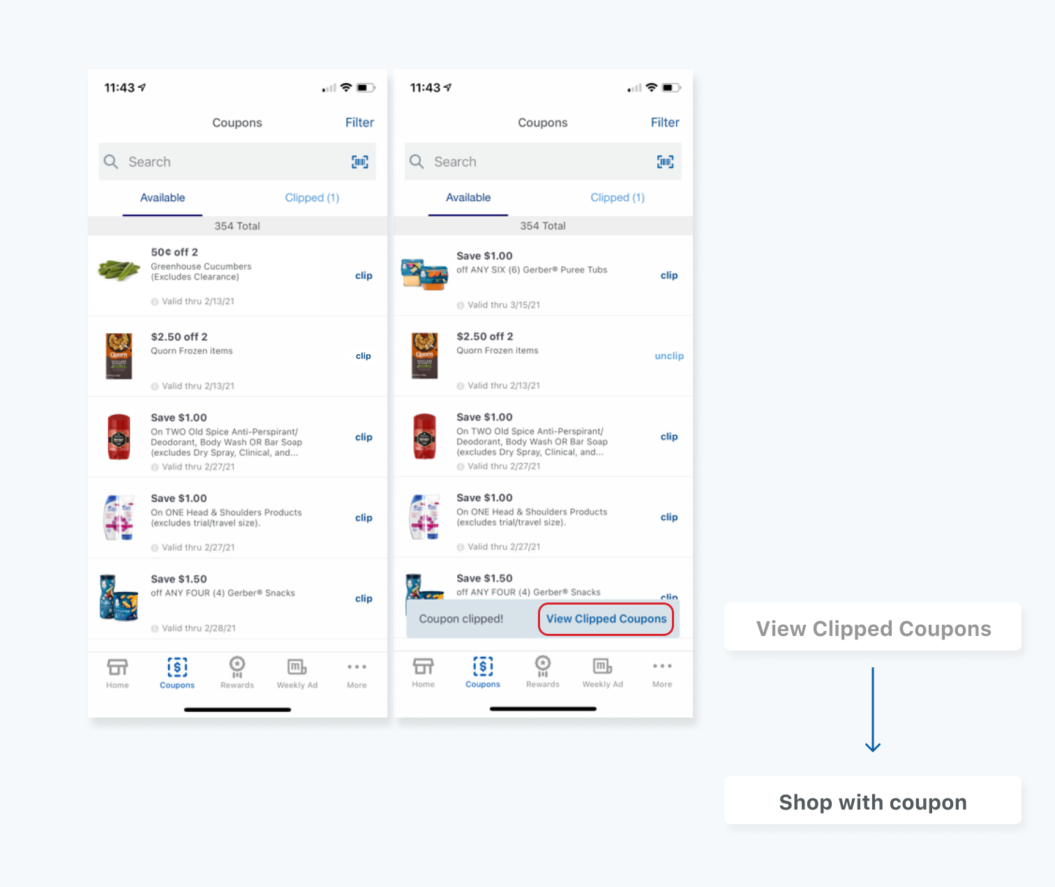
Before:
After:
Basic process:
Previous experience
Meijer has a lot of loyal customers who usually browse coupons during their online shopping.
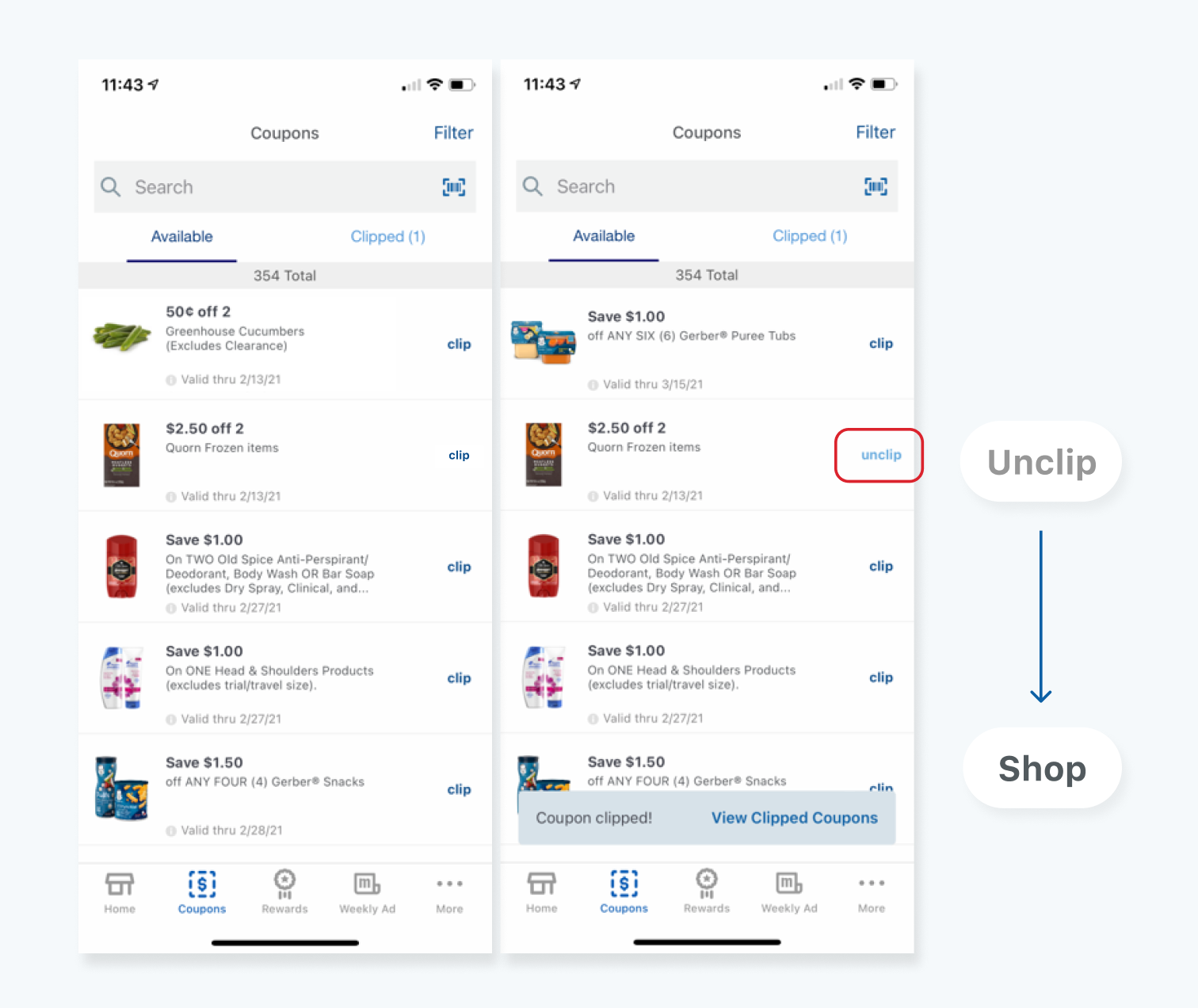
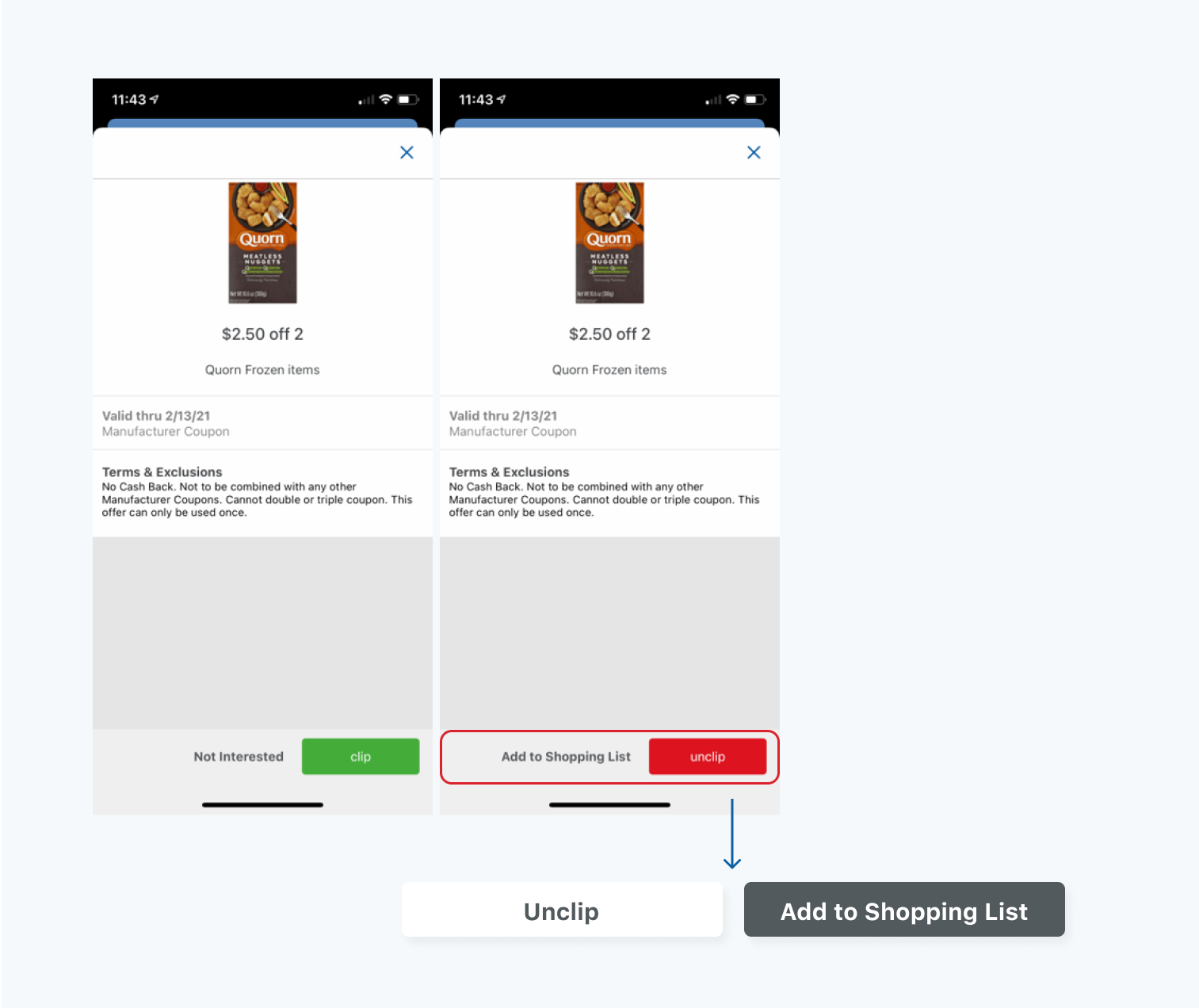
All the coupons are being collected in the Coupons section. Users could clip coupons and also view the details, Valid dates and Terms & Exclusions.
But how could users add the specific product with coupons to their cart?
Ok… if user wants to add on-sale product into cart,
They need to back to the home screen, tap the search bar, input the product name (if they remember), find the specific product, then add it to the cart.
Obviously, frustrated and redundant
Findings from journey maps
We also got some feedback from product team. They interviewed several loyal customers about their experience on Meijer Mobile App. One of the truths is: feeling like they were missing the deals, not finding coupons.
We are getting close to the issue:
The disconnection makes it so hard for users to buy the product with the coupon.
Findings from competitive research
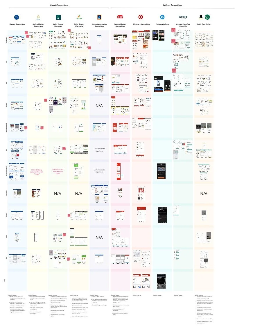
Saving is quite an important feature of online shopping applications. Meijer has several digital competitors. Shipt, Kroger, Instacart, Target...
We did a benchmark to find out how our competitors are doing this connection. Trying to find a solution that more fits Meijer.
Our goal is much clear now:
Connection
Create connection between saving and shopping experience. Increase conversion rate for digital orders.
Enhancement
Encourage users to shop with coupons. increase coupon redemption for digital orders.
Modernization
Update the Coupon pages UI and make sure it’s fully accessible.
What we are going to do step by step:
Insert product UPCs to coupon section
Making coupon clipping as easy as adding an item to your cart
Enticing customers to save more
Celebrating for time + money saved
On the coupon screen:
The efficient solution is to add products to Coupon.
Insert UPCs to the related coupon. Users can easily add products to their cart when viewing the coupon
Encourage users to shop
Update verbiage sounds like a small change, but it did give users a better understanding of the action.
Change the action button
In Coupon List page, Unclip - Shop
Change Verbiage
Toast: View Clipped Coupon - Shop Coupon
Change Primary button
Move Unclip to the secondary button
Besides the verbiage, it is important to give users better awareness of product information. Use some visual components to highlight the information.
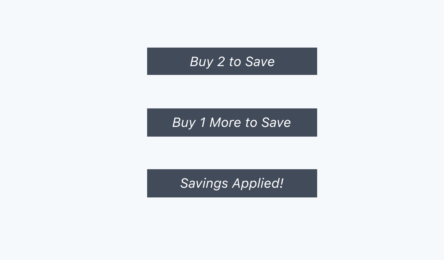
Dynamic Label
Dynamic label can be a good sign for users to know the status
Progress bar
Progress bar is another component that can present how much users need to spend to save money.
How about other components?
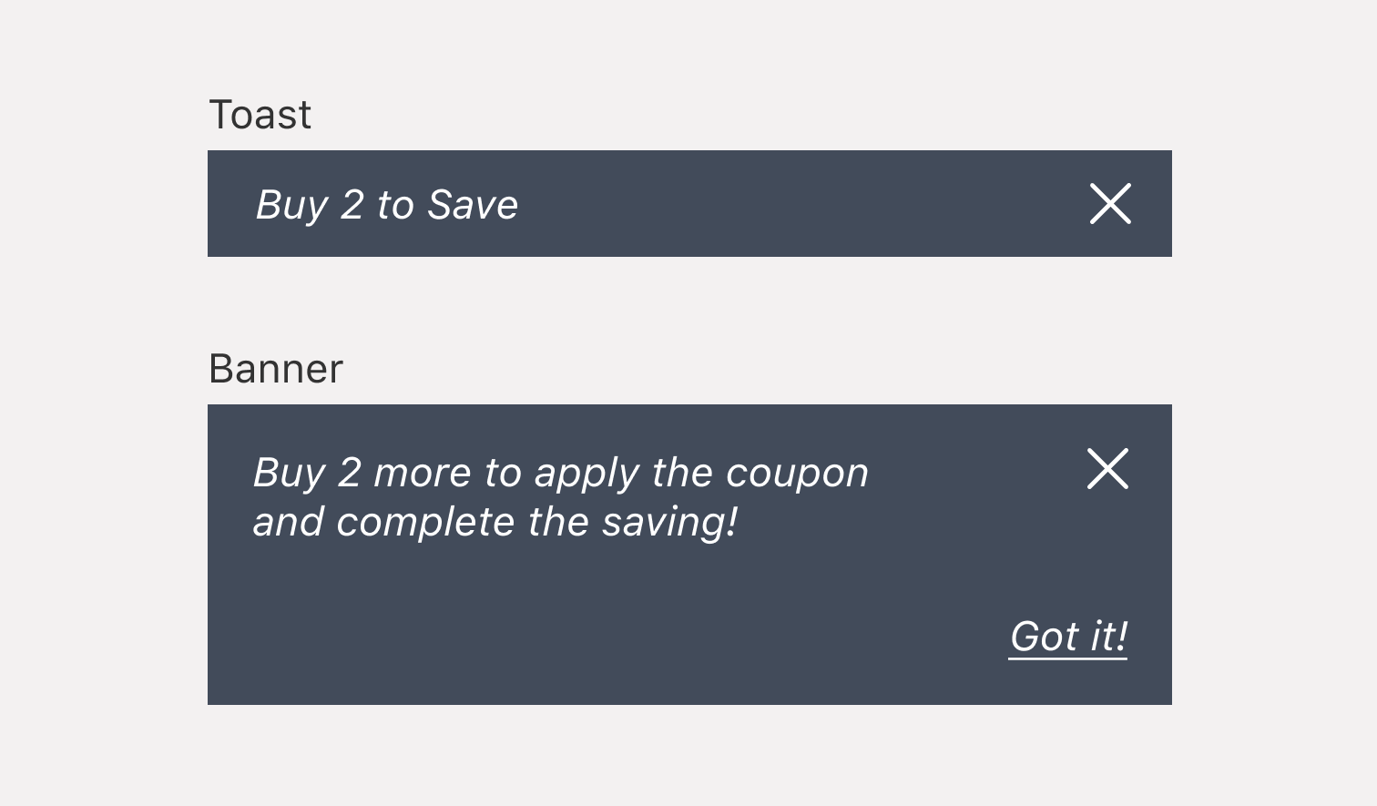
I tried snackbar and banner, but …
Repetitive snackbars. In Meijer APP, the snackbar would be present every time user add or remove product from cart.
Limit space. Banner takes much more space than label or tracker. The appearance and disappearance of the banner bring a louder response, which requires more attention and interaction from the user.
Here is the wireframe 1.0 for coupon detail screen
Proceed the first round of user testing
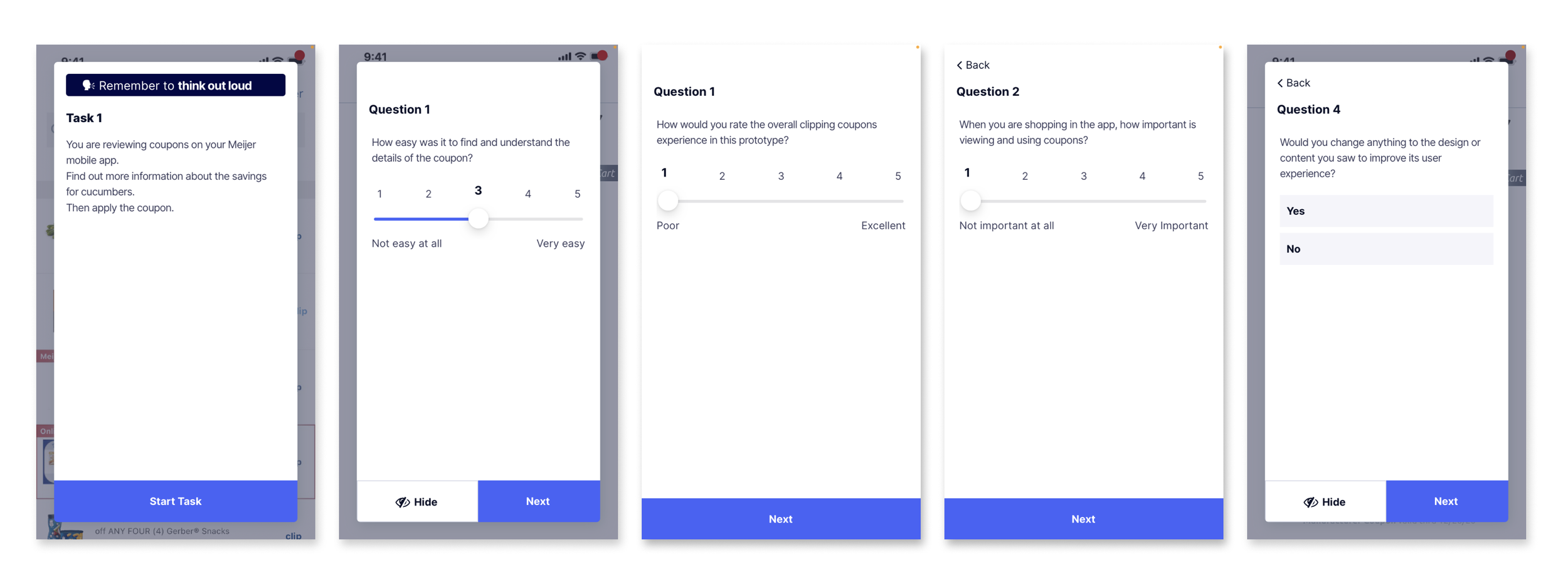
I paired with a UX researcher to test how users feel about the new design of coupon details pages.
Focusing on, if they can understand important information correctly if they can finish the saving tasks.
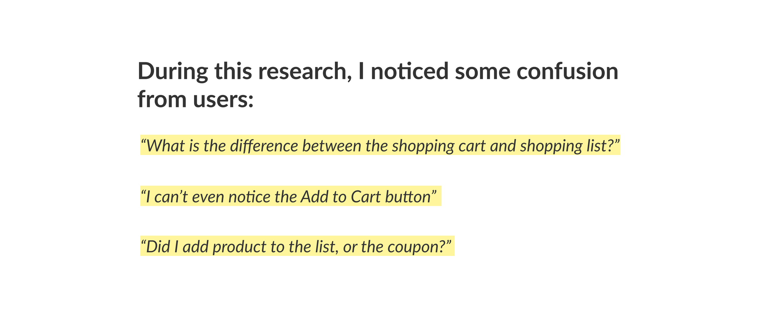
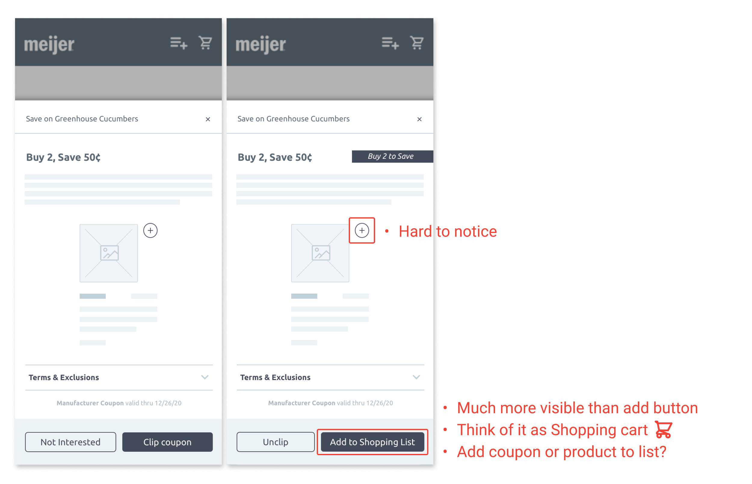
A lot of users were confused about the Shopping List. They can not distinguish between Shopping list and Shopping Cart clearly.
And actually, if the user taps the Add to Shopping List button, it is not the product being added to the list, but the coupon itself. That confused a few users.
The Add to Shopping list button is much more aloud than add product button, which enhances the misunderstanding.
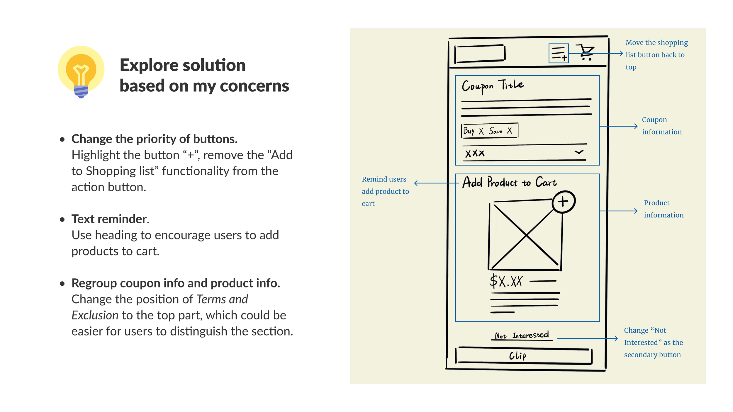
With all of the feedback, I think it is necessary to modify the layout and highlight the main functionality.
We released the feature in Android 8.8.0. Go through the flow by watching the video!
Or, click the button to interact with the prototype 👇

